The Marketing Power of Three

Variety may be the spice of life, but having too many choices turns people away. Our brains have evolved so that we perceive three main things about options presented to us, and the rest gets chucked aside. Give us only two choices, we feel torn. Give us four, we’re confused. Give us three, we pick one easily. Curious, isn't it? When we write about things, talk about things, look at things, we instinctively seek out three options. It's pleasant, this power of three. We don't feel forced to choose between two things and it doesn't feel overwhelming. It feels just right.
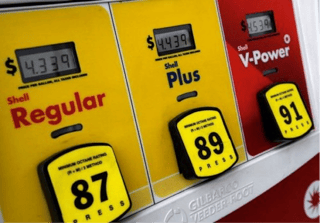
There is evidence of the power of three at work in every aspect of our lives. Three Olympic medals, three types of gasoline at the pump, three varying suffixes for 1st, 2nd, and 3rd (4th, 5th, and so on all get the same ending). Three is the number our brains process well and hold in our memory. Everything after three is quickly forgotten.
- One of the three options is always most popular.
Take a look at the design of any SaaS company website. Look at the pricing, the product offerings. It's interesting to see the application of this phenomenon, isn't it? When you design your cue lineups, pricing levels, or plans for your product, it's best to have three options. In the middle you typically put the option you think most customers will need. It's not necessarily the option you want most of your customers to buy, but it will be likely the most popular one.
- The most popular option is usually in the middle.

Just pick the obvious middle choice. Easy.
When you have a great product market fit, that is, when you build a product or a service that your customers actually want, that product or service in the middle will be what the majority of customers will pay for. Typically, you'd add one other product on each side, a cheaper one and a more expensive one. Or one that is more scalable but less flexible and one that is more flexible but less scalable. You decide, but always have three options: one you think people will need most and two more that offers something different to people who don't fit in the middle category.
Take a look at your menu structure at the top of your website. How many options do you have? Many websites have too many. Whittle it down to three options. Three is plenty. Have three things for people to click on. Crazy Egg can show you a heat map of your website so you can see what people are clicking on and how they browse through your pages. It's a fascinating exercise, if you haven't done this before.
 Still pick the middle? You'll pay a premium now.
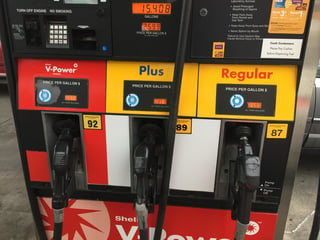
Shell Oil took this phenomenon and used it to trick us into buying their most expensive option. I think most people got used to picking “Plus”, the one in the middle. Shell swapped the order and out of habit I’m sure many people now picked the more expensive V-Power. I know I did at least once.
- The three options are the most typical that you can offer.
What are the three basic items every technology-oriented company should have on its site? Let's see here. It could be Product, Pricing, and More (More being where you hide all those other things that people might be looking for). Or it could be Customers, Products, and Pricing. Or maybe it's the three audiences that you are segmenting your customers into, so that when they enter your website they identify with the audience they belong to and click through to the right content without delay. Those could be Small Business, Corporation, and Enterprise, or something along those lines.
And don’t worry about “hiding” the other options under “other” or in the footer on the bottom of the page. People will find these. Most people should not arrive on your homepage anyway, but on specific landing pages optimized for what they were searching for, or what they clicked on.
Once your eyes are open, you will see the power of three everywhere. One example is three brand offerings: Old Navy (cheap), Gap (moderate), Banana Republic (expensive). Or three television networks: ABC, CBS, NBC. Three usual ice cream flavors: vanilla, strawberry, and chocolate. I can keep going. Three options make it easy for people to choose. If you apply this rule to your marketing, you will design a great website, write great copy for it (emphasizing only three major points), or offer great subscription plans. By limiting options to only three you are spurring customers into action. You make them pick something suitable for them and leave them happy instead of confused and overwhelmed.
And by the way…yesterday I was at the pump and Shell had changed the order again. A/B testing all the time!

Your to-do list:
- Design your website with the power of three in mind. Get rid of extra information or links that will only cause confusion.
- Make three offerings to your customers and highlight the most popular one to make it even easier for people to decide.
- Segment your prospects into three categories and create three personas based on that. Sell and follow-up accordingly.
Topics: Marketing Strategy, Commodity Marketing
.png?width=1500&height=398&name=CO_Corporate%20Logo%202021_4C_HOR_FNL-1%20(1).png)


